The Motion drop zone enables you to view your query in motion, as a series of visualizations. Adding a motion, or play, axis adds visual animations to your charts. Add a date hierarchy to see how your data changes over time.
Video
Motion Axis
Utilize the motion axis to view your visuals in motion
How to Use the Motion Drop Zone
Simply add a member hierarchy to the Motion drop zone (green arrow) to view your query as a moving series of visualizations. For instance, add the month hierarchy to view a series of visualizations, each filtered by a different month, in order to view changes over time.
Any member hierarchy can be used to animate the visuals, not only date/time hierarchies.
The Motion drop zone is available with Cartesian visuals, which include:
- Column charts
- Bar Charts
- Line charts
- Area charts
- Scatter charts
It is also exposed when working with maps and scatter charts.
From the motion play bar (blue arrow) you can:
- Play and pause
- Go back to the beginning
- Skip to the end

Motion Settings
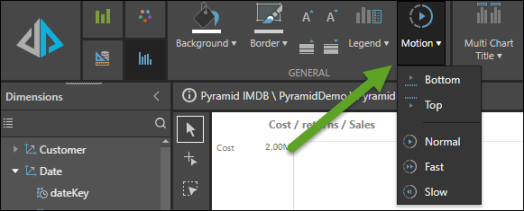
From the Component ribbon, click the Motion button (green arrow) to reposition the motion panel. Click the Motion drop down menu to:
- Move the motion panel: it can be placed along the top or bottom of the canvas
- Change the speed: by default the speed is set to Fast, which changes visualizations at a rate of 1 second. Select Normal to change the rate to 2 seconds, or Slow to change the rate to 3 seconds.